What Color Should You Choose for Your Handled Water Bottles This Q4?
Color is not just a finish. It is a sales decision. Pick the wrong color, and your Q4 inventory sits in the warehouse. Pick the right one, and it sells out before Christmas.
Choosing the right color for your handled water bottle order means balancing two things: what is trending right now and what has proven to sell season after season. The safest Q4 strategy is to put 60–70% of your order into classic neutrals like matte black, white, and grey, and reserve 30–40% for trending seasonal colors like sage green, dusty rose, or terracotta.
Color is one of those things that looks simple on the surface. You pick a shade, you place the order, and you wait for the bottles to arrive. But after years of working directly with procurement teams across North America and Europe, I have seen how one wrong color decision can tie up cash for months. This post covers everything you need to know before placing your Q4 handled water bottle order: color trends, Pantone matching, MOQ thresholds, and lead times. Let me walk you through it.
What Is the Best Color for a Water Bottle?
Some colors feel exciting in a mood board but die on the shelf. Others look boring in photos but disappear from retail floors in two weeks. So which one should you actually order?
The best color for a water bottle depends on your sales channel and your customer base. For most B2B buyers distributing in North America and Europe, matte black, white, and grey deliver the most reliable sell-through1. These neutrals are not trend-dependent, which means they move steadily across all seasons without going out of style.
That said, "reliable" does not always mean "profitable." Here is where it gets more interesting.
Neutral colors protect your inventory. Trending colors grow your margin. The reason matte black continues to lead reorder rates among my long-term customers is simple: it matches almost any branding, it photographs well, and it appeals to a wide age group. White works the same way. These are your foundation colors. They are the ones you should never run out of.
Trending colors, on the other hand, allow you to charge more. A sage green or dusty rose bottle in the premium segment currently commands a noticeably higher retail price than the same product in matte black. This is because it signals intentionality. End consumers associate these colors with wellness, sustainability, and lifestyle choices2. That perception has real dollar value.
The challenge is timing. Trending colors have a shorter window. If you order too late or too much, you are stuck with inventory that no longer feels current.
Here is a simple breakdown of how I help buyers think about color allocation:
| Color Category | Examples | Suggested Order Volume | Risk Level | Margin Potential |
|---|---|---|---|---|
| Classic Neutrals | Matte Black, White, Grey | 60–70% of total order | Low | Moderate |
| Trending Seasonal | Sage Green, Dusty Rose, Terracotta | 30–40% of total order | Medium | High |
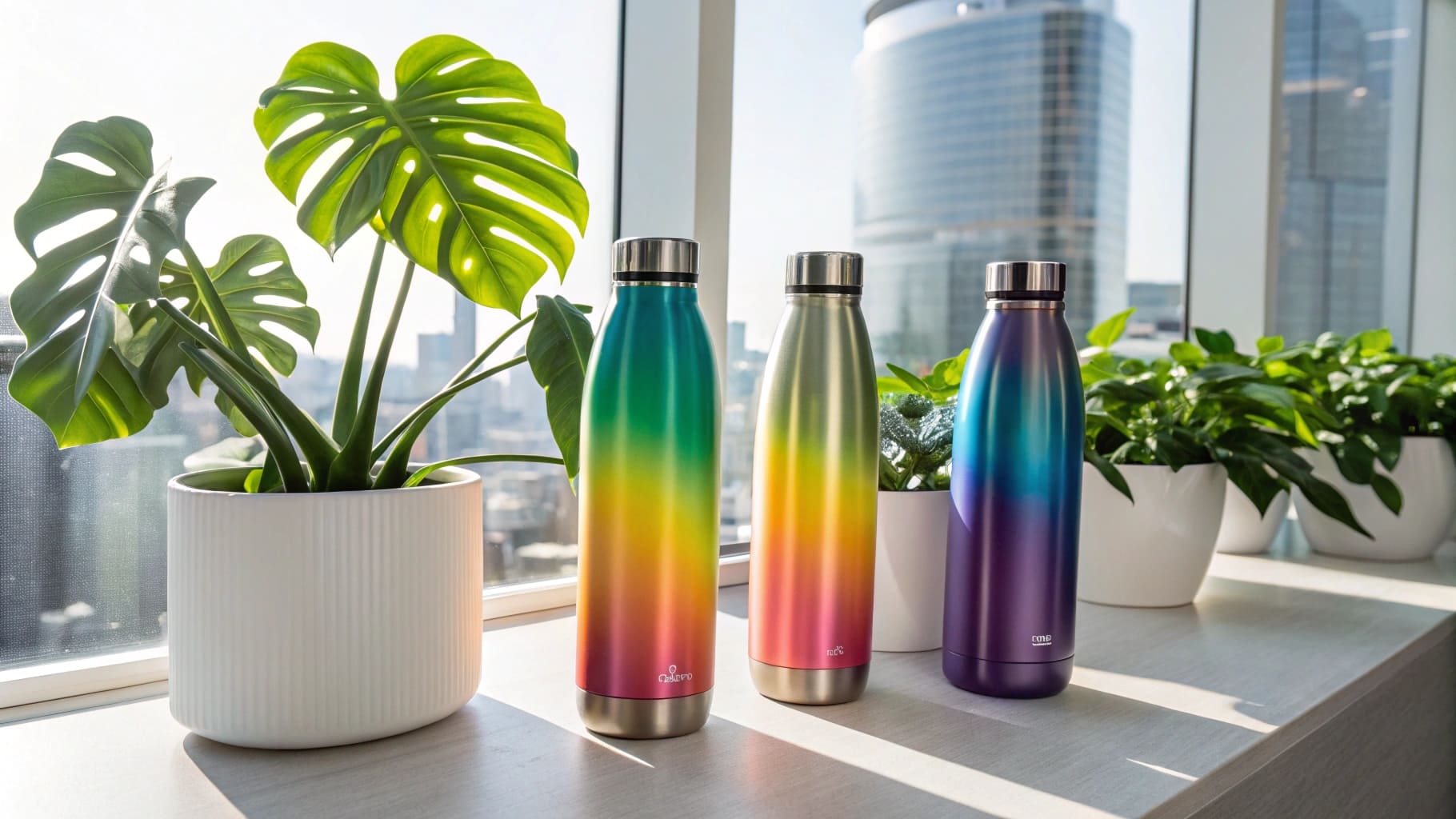
| Specialty Finishes | Gradient, Metallic, Two-tone | 10% or less | High | Highest |
This allocation model protects your investment while still giving your catalog something fresh to talk about each season.
What Water Bottles Are Trending Now?
Trend reports are everywhere, but most of them describe what was trending six months ago. By the time you read about a color in a design magazine, the early adopters have already moved on. So what does the current data actually show?
Right now, earth tones and muted pastels are leading reorder rates in the premium handled water bottle segment. Sage green, dusty rose, and terracotta are the three colors I see coming back in repeat orders most often from European and North American retail buyers.
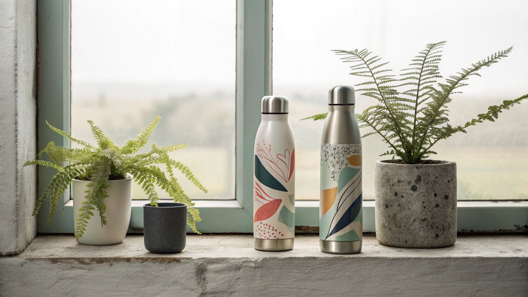
These colors are not random. They reflect a larger shift in how consumers think about everyday products. There is a strong wellness and sustainability movement running through both markets right now3. Consumers are choosing products that feel intentional and grounded. Earth tones communicate exactly that. They suggest calm, nature, and care. That message sells.
But trends move faster than production timelines. This is the part that most buyers underestimate. Let me break it down:
Why these three colors are working right now:
- Sage green connects directly to the wellness and outdoor lifestyle space. It has been gaining traction for two years and shows no sign of slowing down for Q4.
- Dusty rose performs strongly in the gifting and premium retail segment, especially in the female-skewing demographic. It photographs beautifully in lifestyle content, which drives social media conversion.
- Terracotta has moved from home décor into drinkware successfully. It reads as warm, artisan, and premium without feeling overly trendy.
What is fading:
Bright, saturated colors that peaked during 2021 and 2022 are now returning much lower reorder numbers. Electric blue, lime green, and coral are examples of colors that felt fresh two years ago but now feel dated in the premium segment.
What this means for your Q4 order:
If you are ordering handled water bottles for Q4 distribution in North America or Europe, the above trending colors are your best opportunity to differentiate your catalog and justify a higher price point. But you must order these early. Trending colors require longer lead times because the coating process is more complex and supplier capacity fills up faster on popular shades.
| Trending Color | Target Market | Margin Opportunity | Lead Time Impact |
|---|---|---|---|
| Sage Green | North America, Europe | High | +5–10 days |
| Dusty Rose | North America (premium retail) | High | +5–10 days |
| Terracotta | Europe, lifestyle segment | Medium-High | +5–10 days |
| Matte Black | Both markets | Moderate | Standard |
| White | Both markets | Moderate | Standard |
Does Water Bottle Color Matter?
You might be thinking: does color really make that much difference? It is just a bottle. The answer is yes, and it matters in more ways than most buyers expect.
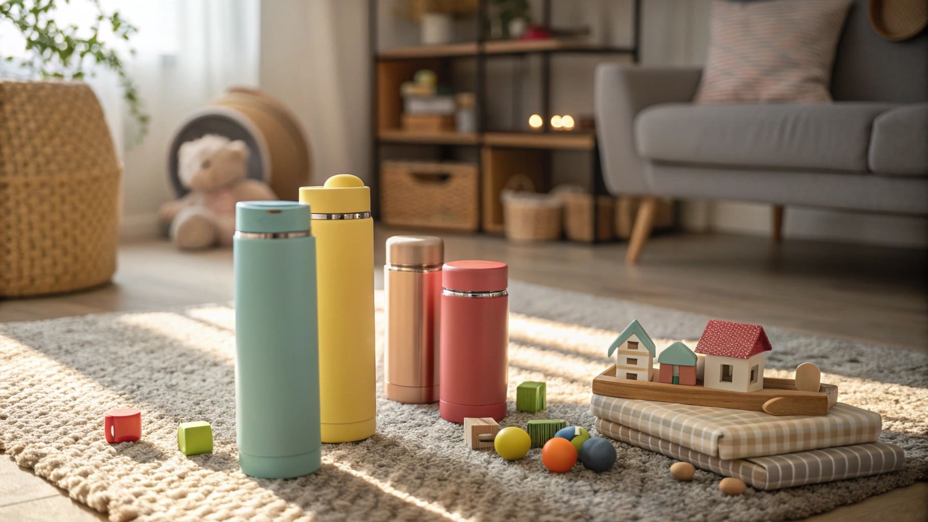
Color affects three things that directly impact your Q4 business: consumer purchase decisions, inventory turnover speed, and production logistics. Getting any one of these wrong costs you money.
Let me go through each one.
Consumer purchase decisions
Studies on retail purchasing show that product color is one of the top factors driving impulse purchase decisions4. For water bottles specifically, color communicates identity. Consumers are not just buying a container. They are choosing something they carry publicly every day. Color becomes part of how they present themselves. This is why a sage green bottle in a wellness context sells faster than the same bottle in beige, even if the product is identical.
Inventory turnover speed
This is the practical side of color selection that affects your cash flow directly. A poorly chosen color can sit in your warehouse for months. A well-chosen one can be gone in weeks. Classic neutrals give you predictable turnover. Trending colors give you faster turnover during peak season but carry more risk outside of it. If you plan your Q4 order correctly, trending colors should be sold out by January. If they are not, you have a problem.
Production logistics and Pantone matching
This is the area where I see the most costly mistakes happen with first-time or less experienced buyers. When you specify a color to a supplier using only a name, you create room for inconsistency. "Sage green" to one factory is not the same as "sage green" to another. If you are placing a mid-season restock order, and the new batch does not match the first batch exactly, your retail client will notice. That is a relationship problem and a returns problem.
The solution is Pantone codes. Specify the exact Pantone number for every color in your order. Most reputable manufacturers, including us at Icobottle, offer Pantone matching for orders above a certain MOQ threshold. Here is what that typically looks like:
| Order Type | Minimum MOQ Per Colorway | Pantone Matching Available | Lead Time |
|---|---|---|---|
| Standard Colors | 500–1,000 units | Not required | 30–45 days |
| Custom Pantone Match | 1,000–3,000 units | Yes | 35–50 days |
| Specialty Finishes (gradient, metallic) | 2,000–3,000 units | Yes | 50–60 days |
For Q4 orders, this lead time information is critical. If you want your bottles delivered and ready to distribute in October, you need to confirm your order by late July or early August at the latest. That window accounts for production time, quality inspection, and shipping. If you are ordering custom Pantone colors or specialty finishes, move your confirmation date even earlier.
I have spoken with buyers who placed Q4 orders in September expecting November delivery. They missed the peak season entirely. Not because the factory was slow, but because they did not account for the full timeline from order confirmation to warehouse arrival.
The other thing worth noting is that Pantone matching adds cost. The price difference per unit is usually small, but it is there. For most B2B buyers distributing at a premium, this cost is more than recovered through the consistency it delivers. A mismatched restock order costs far more in returns, complaints, and lost client trust than the Pantone fee ever will.
Conclusion
Choose your Q4 colors based on data, not guesswork. Use neutrals as your base, add trending colors carefully, specify Pantone codes, and place your order before August to protect your timeline.
-
"The Relationship between Color Preference and ...", https://digitalcommons.lindenwood.edu/cgi/viewcontent.cgi?article=1092&context=psych_journals. Market color-preference data across durable consumer goods consistently show white, black, gray, and silver among the most widely selected neutral colors, providing contextual support for the claim that neutral colors have broad appeal. Evidence role: statistic; source type: research. Supports: Neutral colors such as matte black, white, and grey are likely to have broader and more reliable consumer appeal than niche seasonal colors.. Scope note: Such data are usually not specific to handled water bottles or B2B sell-through rates. ↩
-
"Color Matters: A Study Exploring the Influence of Packaging ... - PMC", https://pmc.ncbi.nlm.nih.gov/articles/PMC11475816/. Color-psychology and sustainable-consumption research links green and earth-toned visual cues with nature, environmental meaning, and wellness-related associations, supporting the stated consumer interpretation of these palettes. Evidence role: mechanism; source type: paper. Supports: Consumers may associate muted natural colors with wellness, sustainability, and lifestyle identity.. Scope note: The evidence is associative and does not prove that every sage, dusty rose, or terracotta bottle is perceived this way by all consumers. ↩
-
"Sustainable consumption - OECD", https://www.oecd.org/en/topics/sub-issues/sustainable-consumption.html. Consumer surveys from international institutions and major research organizations report sustained consumer interest in health, wellness, and sustainability in North American and European markets, supporting the broader market context. Evidence role: statistic; source type: institution. Supports: Wellness and sustainability are significant consumer themes in North America and Europe.. Scope note: These sources support macro consumer trends, not direct demand for specific water-bottle colors. ↩
-
"(PDF) Effect of Colour on Marketing", https://www.academia.edu/16464854/Effect_of_Colour_on_Marketing. Marketing research on color and consumer behavior finds that color affects product evaluation, attention, and purchase intention, supporting the claim that color can influence impulse-oriented retail decisions. Evidence role: expert_consensus; source type: paper. Supports: Product color can significantly influence consumer purchase decisions, including impulse purchasing.. Scope note: The literature supports color as an influential factor, but rankings such as “one of the top factors” may vary by product category and study design. ↩